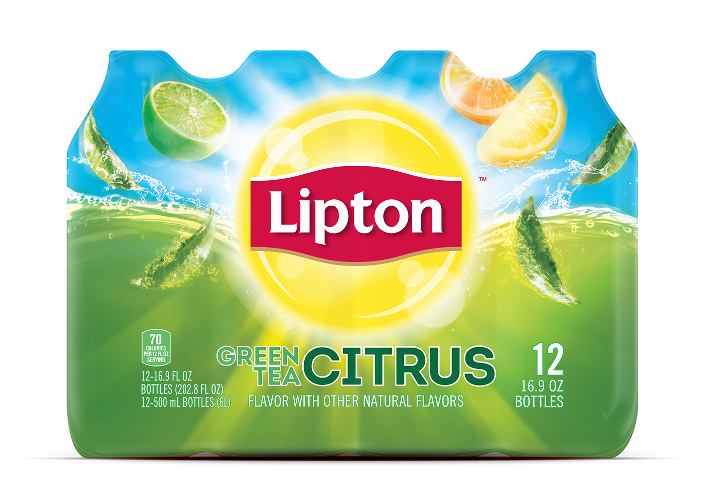
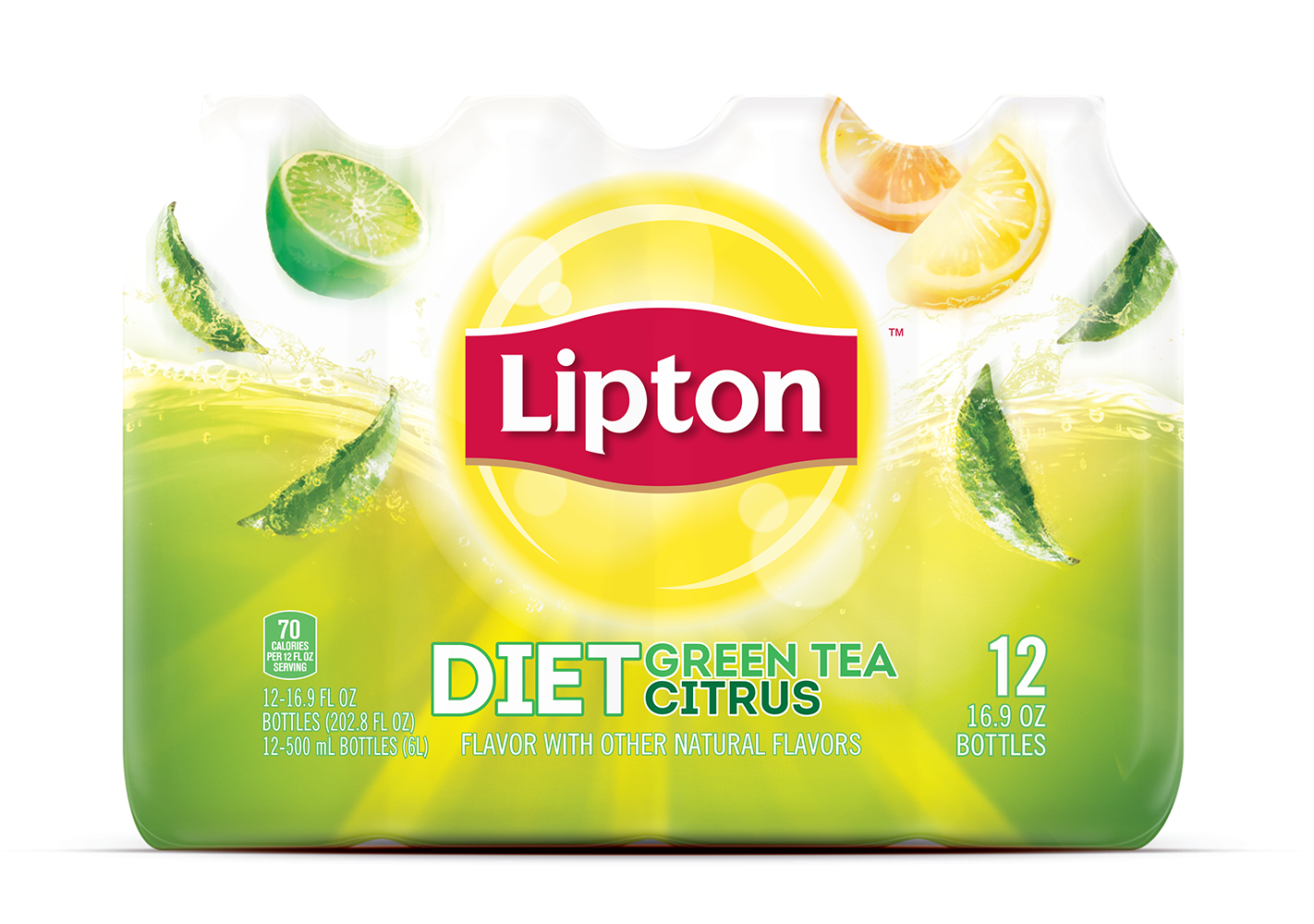
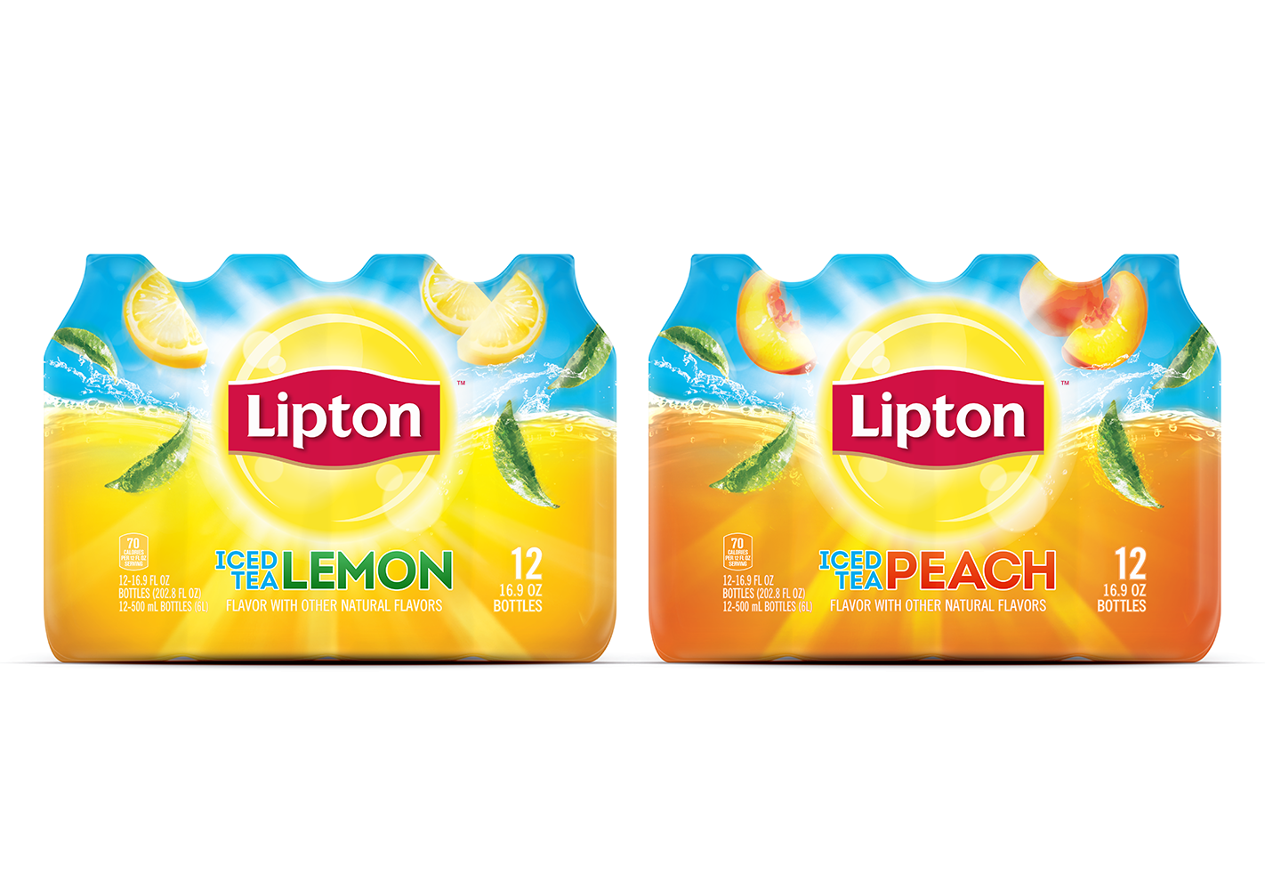
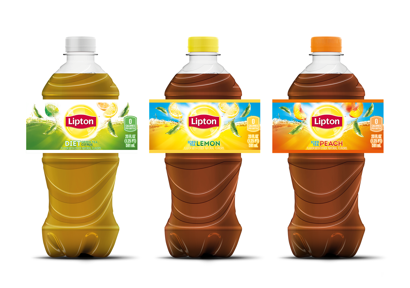
Brief:
Lipton were redistributing their Iced Tea range across 'club' supermarkets in the US using the new Lipton global branding/design. The term 'club' refers to the super supermarkets in the US where families do their shopping in bulk.
Rationale:
The challenges were many as the most popular distribution, the 500ml bottle 12 pack, is shrink wrapped, a process which creates massive distortion to any design. This gave us very little room for branding, type and legals. The US legalities where also extremely strict, no fruit allowed to be submerged in liquid providing the most difficulty. With all this in mind we needed to create a design that encapsulated the flavour and refreshment of the product.
The refreshment is generated from the Lipton Logo, with the illusion of it splashing into the liquid. The falling fruit and tea leaves then promote the natural delicious flavours available. With flavour and variant name hierarchy developed to fit neatly and clearly within the safe areas giving max on shelf appeal and stand out.
The design was applied across several formats including multi-pack, single and multi-serve.